Learning and social connection on college campuses are wrongfully mutually exclusive. Constrained by social norms and a lacking infrastructure for nurturing growth, colleges everywhere neglect accessing the full potential of their students. Learning should not be sequestered to the classroom alone, it should be something that students have the opportunity to engage in at any point in their day, from any source.
PassOn, exists as a social bartering app and subsists on the belief that we all have an innate desire to both learn and share. Learn how to yoyo from a competition-oriented professional, have an hour-long lesson with top-notch musician, hone your tennis abilities with a skilled player: through expensing or trading skills, social interaction and learning can be combined into one holistic experience.
Currently, the stakeholders of this project are the Dartmouth student population. If our product is met with success, we hope to integrate our concept more comprehensively with help from the administration. Looking to the future, we are also interested in expanding our service to other universities, high-schools, and potentially other similar communities.
I successfully pitched, recruited a team, and worked on this project as the culminating experience for both CS52: Full-Stack Web Development and CS25: UI/UX Design. I acted as Project Manager, Designer, and Developer for a team of five other Developers and one other Designer.
Defining the problem ➜ Defining users ➜ Product research ➜ User research ➜ Sketches ➜ Grayscales ➜ Initial usability research ➜ Initial hi-fi designs ➜ Further usability research ➜ Final hi-fi designs ➜ Final round of usability research ➜ Prototyping
Defining the problem ➜ Defining users ➜ Sketches ➜ Scaffolding ➜ Setting Up Backend ➜ Defining Dependencies ➜ Sign Up/Sign In Authentification ➜ User Relationships ➜ Messaging ➜ Skill Matching ➜ Search Capability ➜ User Connection Algorithm ➜ Front/Backend Communication ➜ Styling
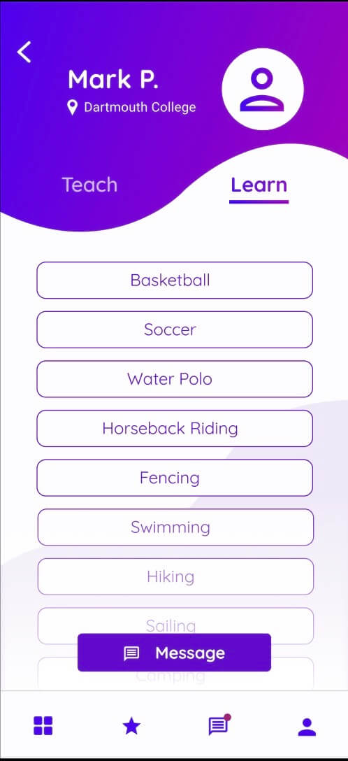
Skill acquisition is centered around two distinct points — teaching and learning — and, while both are necessary parts of the skill acquisition process, I believed the main buy-in for users is focused around the aspect of learning. While both sides are essential to a skill-sharing platform, I theorized that engagement must be focused around the user themselves: what they want precedes what others desire. I believed the app should function as free market: user’s place value on other people’s products and offer their own as compensation. The initial interest has to be on the side of learning; only then will the majority agents be willing to share their skills.
We designed our primary user-flow on this ‘learn-oriented’ concept: onboarding refines a user’s interests to teachable skills and the home page presents them with a list of users teaching those skills. The user finds a suitable teacher and is prompted to exchange something they can teach for the skills they want to learn. They then are guided to create a ‘skill card,’ much like the one that they just interacted with, to add to their profile and offer to that user. Usability testing proved that this was an intuitive process: users smoothly navigated through the learn-oriented screens with little confusion and generally felt comfortable adding their passion to exchange once an appropriate teacher had been found.
The actual process of proposing a connection is one of the most important steps in any social network. As such, I believed this particular step must have some nuance beyond merely finding and connecting to potential teachers; users should feel comfortable both sending and receiving new connections. Hoping to mitigate the potential fear of reaching out to new people, as well as any nervousness associated with a stranger reaching out to you, I thought it was important for users to both have granular control over their interactions and to be presented with only relevant information upon initial interaction.
In regards to granular control, I thought it was important to frame connections are the concept of ‘requests.’ Much like Facebook friend requests, users should be able to determine who they want to interact with. Going one step further, the introduction between two strangers should be as seamless and standardized as possible. Thus, a request is initiated with the necessary information of what proposed exchange would look like and the information is presented to the associated party in a generated format. The users can proceed to negotiate the terms of the exchange (what passions being shared, timing of each session, potential monetary compensation) through the layer of a generated format, before the connection is approved and users can message each other freely.
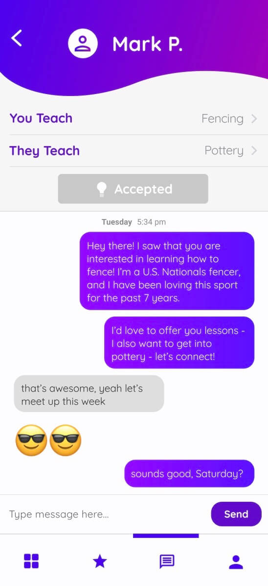
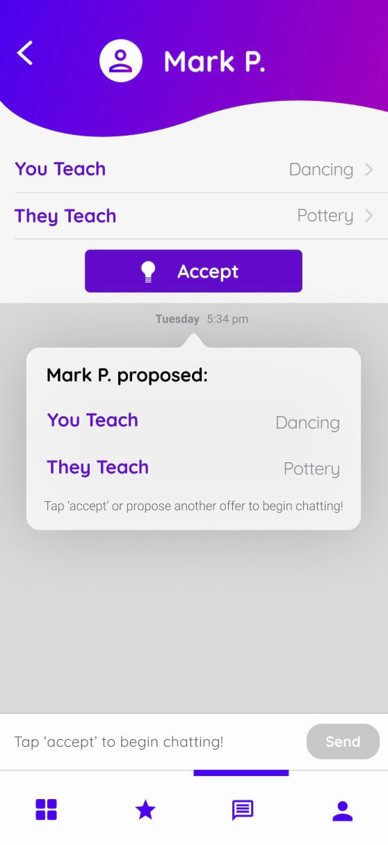
Our user testing showed that many users have some apprehension around communicating and meeting strangers. Instead of neglecting these fears, I found a way to address them head on. Users suspected certain trades would feel unequal so we made mutual agreement a prerequisite of connection; users expressed the process of bartering could be awkward so we made the other user robotic up until the point where consensus is reached; users relayed a fear of having random people message them so we created the barrier of requests and their ability to be declined.
In each of these cases, users expressed a sentiment in direct conflict with the premise of our app as a whole. While it was disheartening hearing so many concerns with the app’s interaction as a whole, empathizing with these beliefs was the single greatest turning point of this app. A few intense design sessions later and our user experience was refined to the point where is was actually usable. Users responded by intuitively navigated our new interface and expressed no hesitation or concern with reaching out to new people. Success!
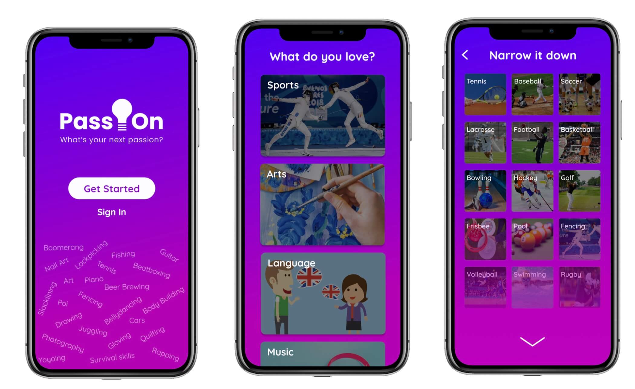
A new user is greeted with a bold splash screen and an onboarding process that familiarizes the user with the app and lets them customize it according to their interests.
A returning user lands first on the ‘Home’ page, which offers the user a sample list of possible matches that share their interests. Everyone in the ‘Double Matches’ list can teach the user a skill they’re interested in and wish to learn something that the user is an expert in. All of this matching is personalized, based on the user’s profile. The user also has the option to execute a quick search for a specific user or skill, if they know what they are looking for.
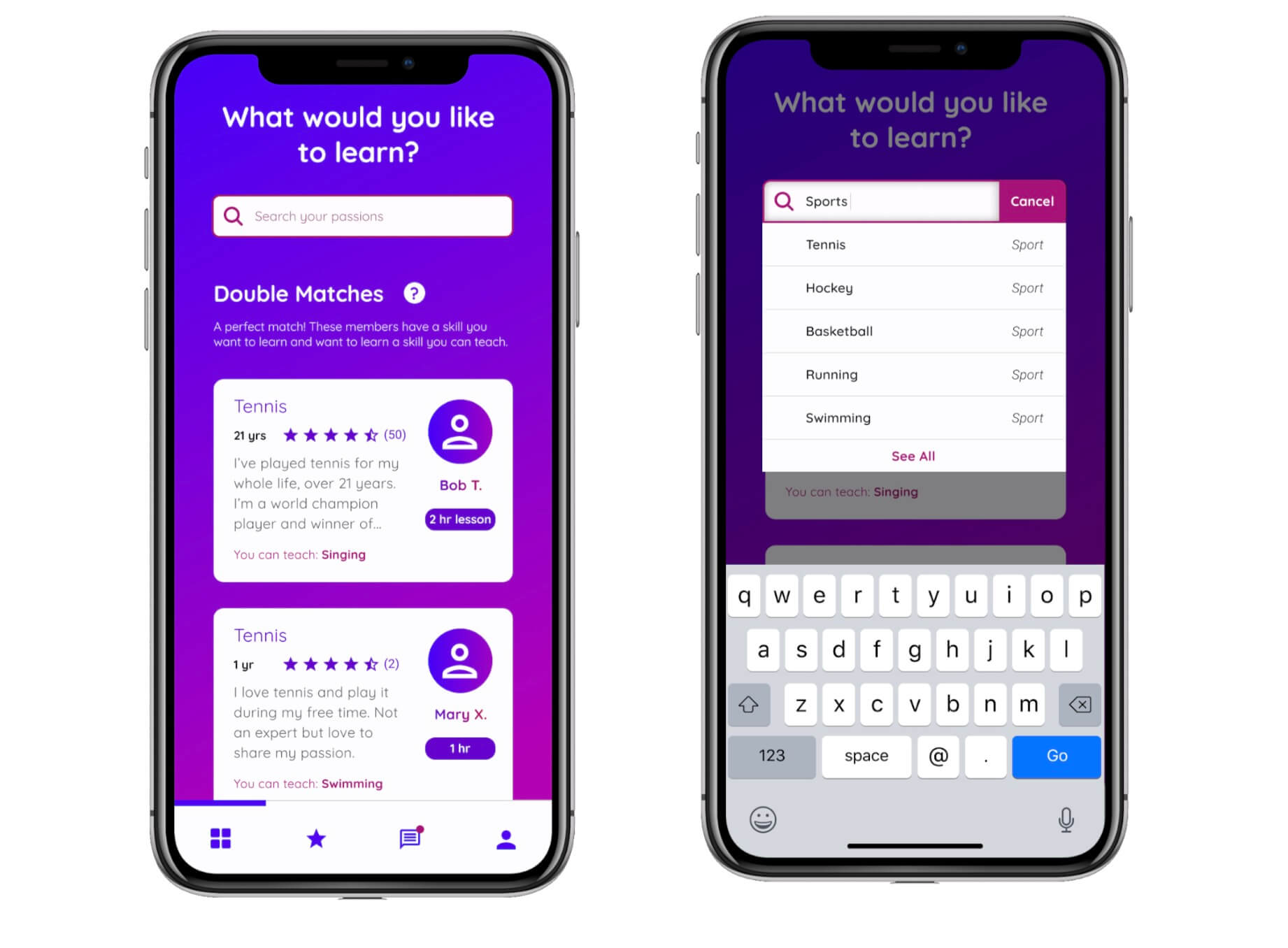
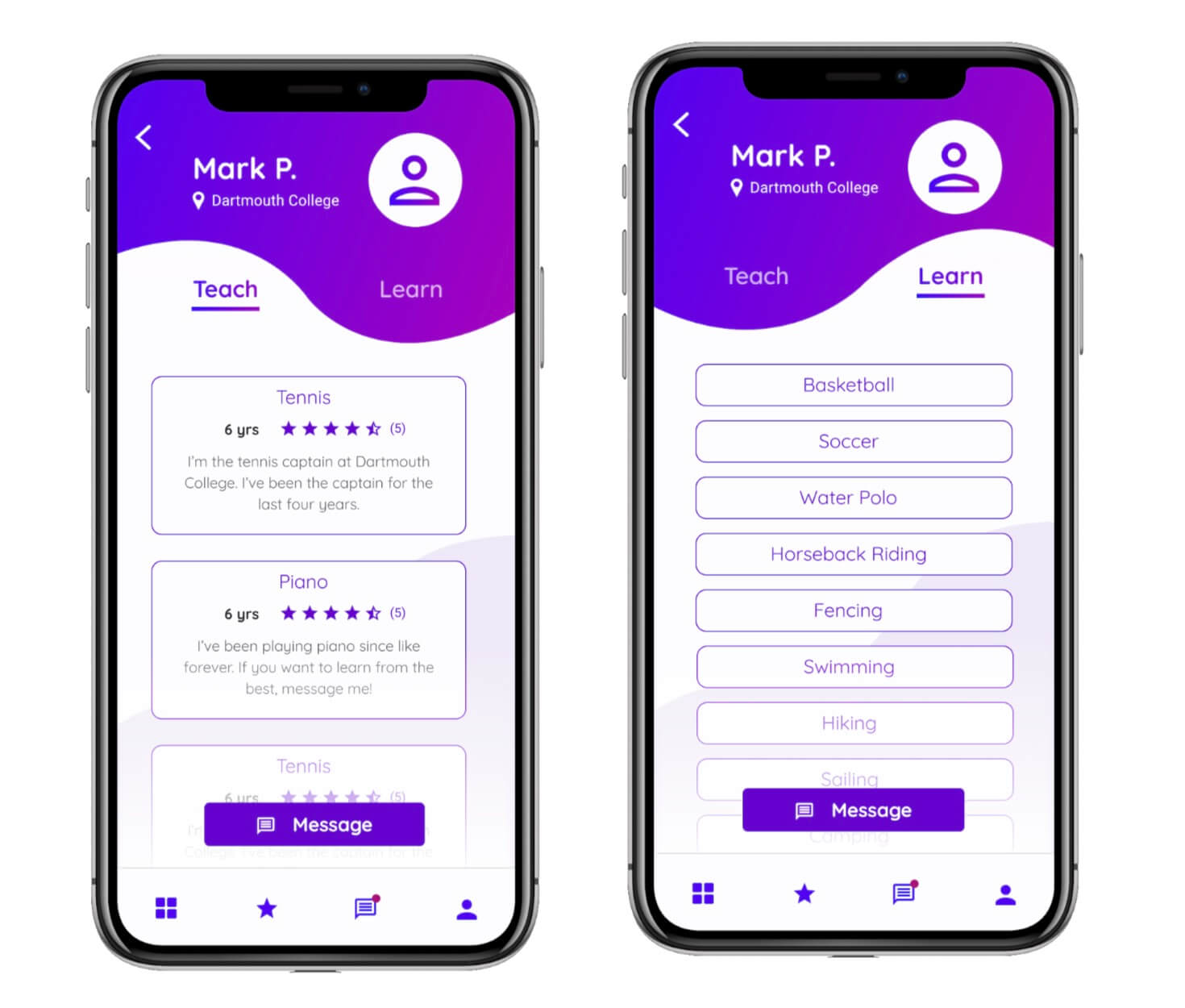
A new user is greeted with a bold splash screen and an onboarding process that familiarizes the user with the app and lets them customize it according to their interests.
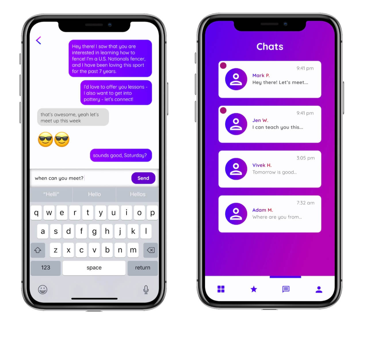
Messaging takes a unique turn in PassOn. Through our user research, we found that planning with other people can often be a lengthy, messy, and frustrating process via text. So we decided to ease this experience by having a ‘Proposal’ feature. A user who wishes to reach out to a peer can propose a ‘skill trade,’ where they set what they wish to teach and what they wish to learn.
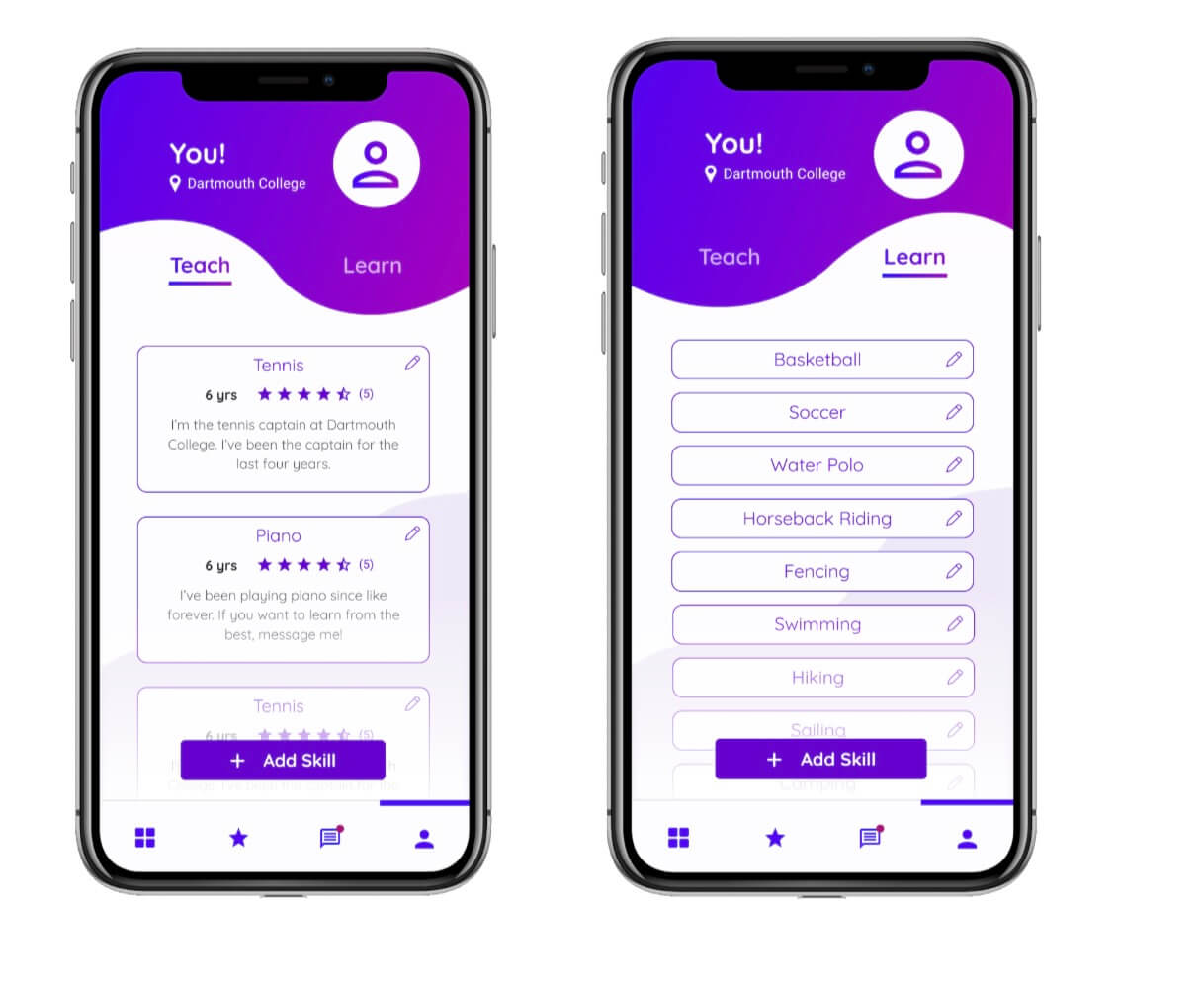
Finally, the user has full control over their own personal profile. On the ‘Profile’ page, they can add, view, and modify the skills they are offering to teach and wish to learn.
I would also like to thank my wonderful team for their hard work, passion, and dedication to success. From both a development and design perspective, this was quite a hefty project; I am proud of their persistence, teamwork, and engagement in the process of innovation. Finally, a huge thank you to Lorie Loeb, Natalie Jung, and Tim Tregubov for their feedback and belief in our ability to achieve success.